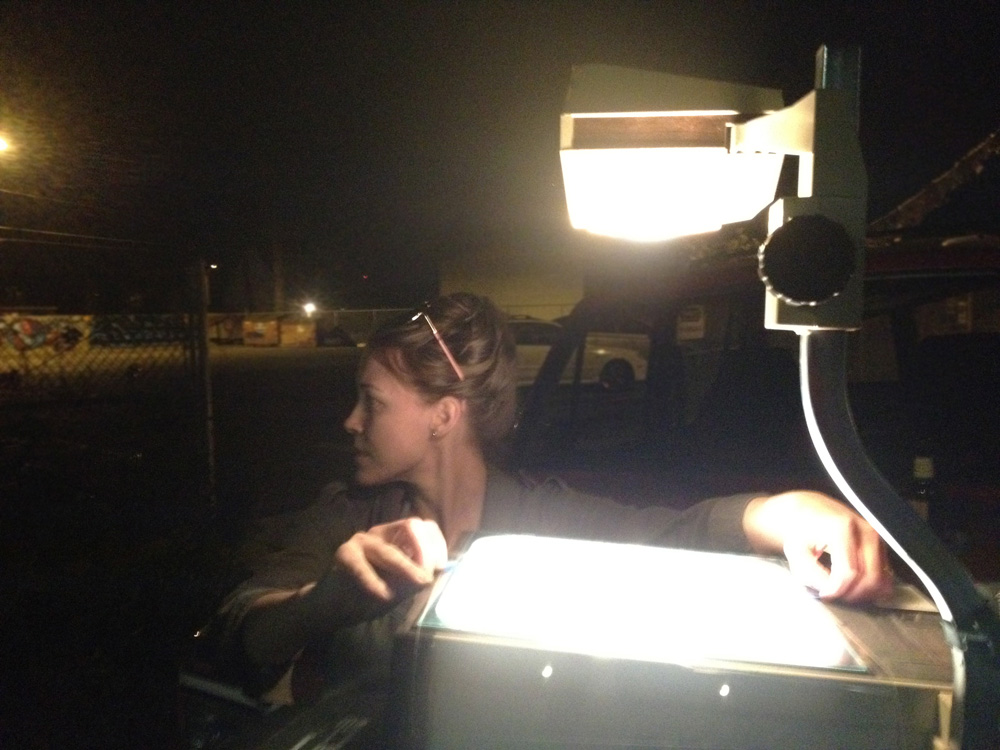
My Paints and Palette
- posted in Journaling
My husband Cam and I were discussing pigment colors and paint over the dinner table. You know, typical married couple chit chat. Cam is an oil painter currently attending Arizona State for his MFA. We must have talked about it for at least half an hour–about the different colors we have tried and how we mix them. We talked about our palettes. I said to Cam, “You know, I work with my palette just about every day, but I never talk about it.” I realized that I have a love affair with my color palette, working closely with it to create my illustrations. I thought I would share some details about what I work with to create my watercolor paintings.
Paint
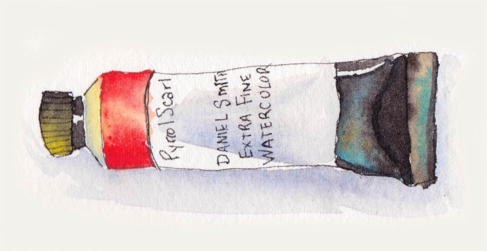
I am brand loyal with my paints, and I mostly use a combination of Winsor Newton and Michael Smith depending on the color. My favorite color is Daniel Smith’s Pyrrol Scarlet. It is very bright. Currently I am using Daniel Smith’s Quinacridone Rose for fuscia and Hansa Yellow Deep as my main yellow, but I’m not too particular about using a consistent hue or brand for them. In fact they can vary quite a bit but that keeps things exciting. I use Daniel Smith Cobalt Blue. You have to be careful not to over mix the blue or it will get muddy very quickly. By itself or mixed lightly with one other color, it is magical. I used to mix Windsor Newton’s Brown Madder with Antwerp Blue to make all my darks. These days I use Daniel Smith Perylene Maroon with the Antwerp because it creates a much richer darks. I also use Winsor Newton Professional Green Gold, Winsor Newton Winsor Green (Blue Shade). I use both Winsor Newton Bismuth Yellow and Winsor Newton Professional Winsor Red sparingly. Red is a very flat color, so a lot of other colors get mixed with it to create dimension. I also use M. Graham & Co. Cobalt Teal. I don’t own a tube of black or white. Straight black is very flat and to lighten color, I just add water.
Palette
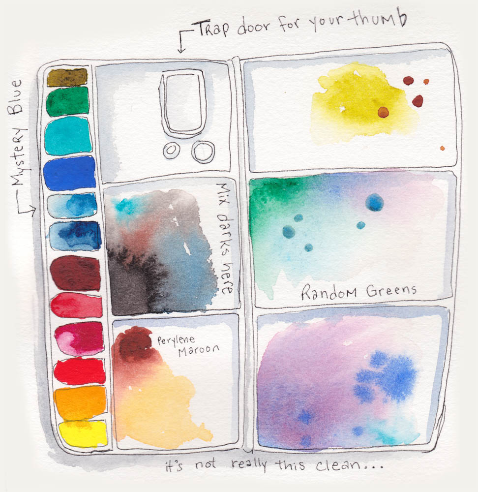
The palette I use is the one I got in Intro to Watercolor in college. It folds up nicely for storage or travel. I am starting to wonder if I should get a larger palette, since I don’t have room for all of my pigments in the little slots anymore. I was thinking recently that I should clean my palette. This is something I probably do no more than once a year. I always have a spot of mixed paint in the center where I make my dark pigments. In one of the slots there is a random blue that varies from random tubes. I never remember what paint is actually in that slot and I don’t use it very often. I don’t have a whole lot of explanation beyond that for it.
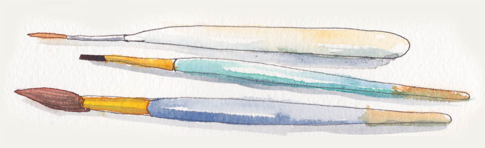
Brushes
I am not a brush snob. I like to go to different craft stores when there is a sale and get a cheap pack of multitple sized brushes. I only use round brushes and I don’t like them to be too absorbent or it won’t release the water and paint onto the paper. I also stock up on nicer quality fine tips when one of the local art shops is having a sale. I keep my brushes in a rotating wire container that was meant for cutlery.
Other Supplies
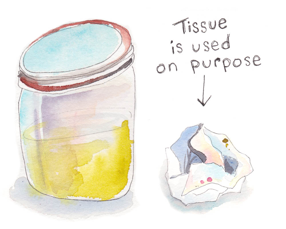
I use a mason jar for water and I keep my paints in one of those plastic pencil boxes that kids use in grade school. I also use facial tissue. When people watch me paint, they often think that I must have made a mistake when I grab a tissue. This could not be further from the truth. Using tissue is all part of the process of creating watercolor…at least it is for me.
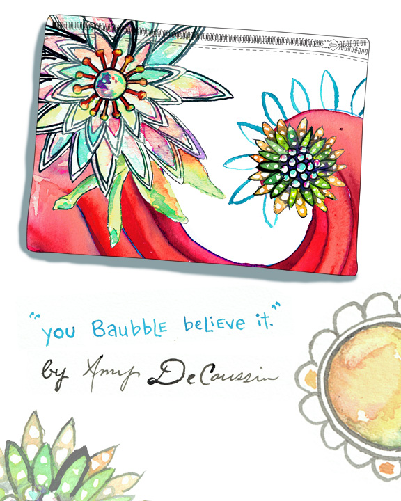
Amy DeCaussin specializes in Illustration. View her work here, amydecaussin.com.
For illustration, image licensing, agent representation,
and other creative projects contact Amy: amydecaussin@gmail.com.